Ghost signs, blade signs, hand painted signs, OH MY!

I guess it's a "sign" of the times!  Growth is REAL in DC right now and with every new establishment there is a need for a intriguing sign.  It is still true that you never get a second chance to make a first impression and the first impression (other than hundreds of recommendations via social media) is the sign of an establishment. 

These past years have brought us great opportunities to flaunt our custom sign skills — ghost signs, hand painted signs on interior and exterior walls, blade signs, neon signs, and the simpler signs of reproducing a logos. The work has been super fun and diverse which keeps our creative juices flowing!

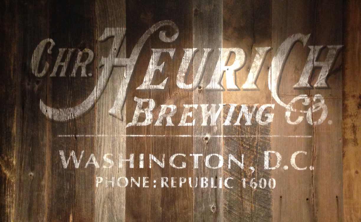
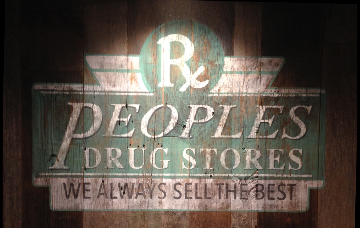
One of our favorite recent accomplishments was working at Nats Park in their two newest premium suites. We were hired to paint ghost signs of old DC landmarks. Research first, present ideas and sample boards, gain approval and GO!  Truly a pleasure to work at the stadium and the client was thrilled with the results.  I guess that's a "good sign" that we're doing something RIGHT!

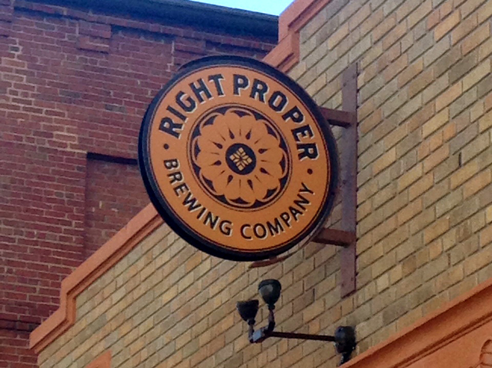
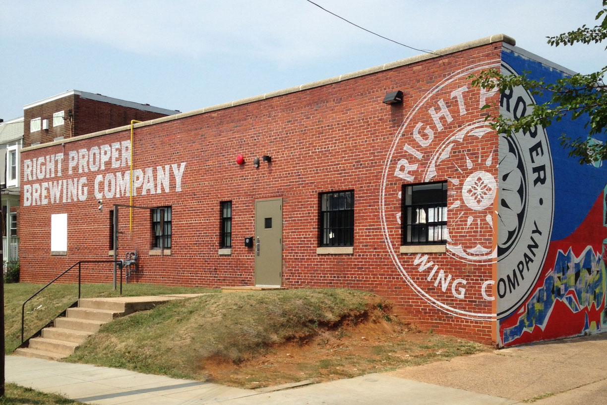
Then, of course, there is Right Proper. Three years ago we had the opportunity to create a blade sign for their initial endeavor.  A call back for their new location was another "good sign" that we create a quality product.  This time around it was two huge ghost signs on the exterior of their new building. The work was challenging as we got started on the hottest week in DC, but it all turned out fabulous! Of course we were thirsty but since they weren't brewing yet we had to settle on WATER.  I'll be first in line once the place opens up!

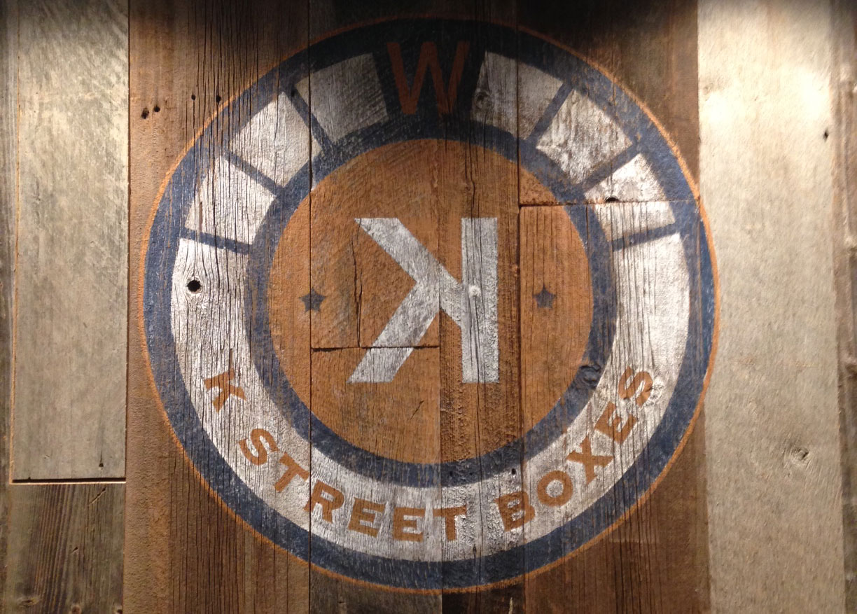
Somehow Bo Blair and his group continue to knock out high quality establishments and I'm happy that we are playing a roll.  Besides Surfside and Jetties, we recently helped to make DUE SOUTH the awesomest (is that a word?) eatery at The Yards (that's the commercial name created for great things happening at Navy Yards).  A couple of faded logos on reclaimed barn wood and a reclaimed retro marque style arrow with our addition of TAKE OUT help to give the place charm.  Only problem is that we heard the food is so good folks seldom look up from their plates!

Brewpubs are here to stay, thank God!  After meeting Bill Madden, the owner and brewmaster,  at Glover Park Day we let him know that we wanted IN on his newest endeavor in Glover Park (their original location is in Falls Church, VA).  After a few months of back and forth we found two great locations for our handiwork.  Below are samples of our ghost sign on the upper level and a crisp and clean look on the lower level.  Great owner, great beer and, uh, GREAT SIGNS!


Occasionally we work directly with the architect to make their vision a reality.  In this instance we teamed up with I Studio to reproduce the logo for The Body Image.  This approach is usually a little less creative but either way it is gratifying to produce a quality sign and know that it's a job well done.


Look at the signs around YOU.  Good signs?  Bad signs?

Our experience is diverse, our clients fun, our portfolio expanding everyday. Check out our full portfolio here

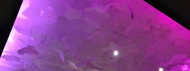
Raku Ceiling Art Installation

Raku Ceiling Art Installation

Slow and steady wins the race.  

Our true preference for jobs is:

  1. Get the gig
  2. Think it through
  3. Submit ideas
  4. Get approval
  5. Knock it out!   

Unfortunately, with restaurant planning, it doesn't always work this way.  With the Raku ceiling art installation, taking our time on such a big project paid off.

Unfortunately, with restaurant planning, it doesn't always work this way.  With the Raku ceiling art installation, taking our time on such a big project paid off.

In this situation there were many players - architect, construction folks and of course, the owner. As I looked back through old emails I realize that this journey began over a year ago in May of 2014!  It is finally, the end of July 2015 and Raku is OPEN! 

The architect reached out to us with a concept for a type of suspended ceiling art installation that evokes the idea of cherry blossoms.  Cool! Off to the drawing board we go!

Water Glasses Everywhere!

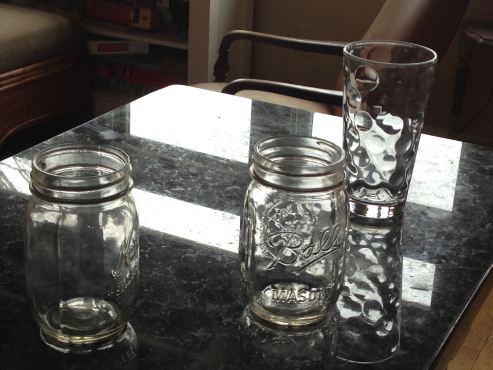
After years of wanting to share the brilliance of a small little accessory on our counter, today is the day. Don't ask me why, I don't know, perhaps it was because it was one of the days it was NOT in use, or perhaps it was one of those days that I am in awe of Jarrett and his creative mind and talent, who knows but here it is: The Conserve Water Glass Holder. Not the official name, because there is not an official name. In our house it is called YOUR SPOT, we say, "Put it in Your Spot". Or now, after so many years, there is not much coaching, which I guess is why it needs no name. 

Here is how it works: You drink water, you put your glass in your spot, you reuse it all day, you put it in the dishwasher (or wash it by hand) at night. Simple. Less running the dishwasher (with three kids we would go through LOTS of water glasses in one day), less water consumed, clean countertops, routines started, habit sealed, the end! 

And because of Jarrett and his creative genius, it is not only functional, it looks fantastic! It is just one of those things that makes me happy on a daily basis. Thank you Jarrett Ferrier!

 What it used to look like (ok, we do live with teenagers, so it still SOMETIMES looks like this) 


What it used to look like (ok, we do live with teenagers, so it still SOMETIMES looks like this)


 Custom look to match our kitchen and our kids names (has lasted pretty well for 10 years!) 


Custom look to match our kitchen and our kids names (has lasted pretty well for 10 years!)


 Fits most sized glasses!


Fits most sized glasses!

A Man's Recollections

What I DID NOT expect at first was that the fact that One Man's Recollections would serve to provide reflections for others.  Since the installation of this project along busy Connecticut Avenue, just inside the DC line, I've received emails and phone calls expressing how many others have come to recall their experiences of going to games as kids.  It becomes a shared moment among strangers.  He might have been sitting in the same section on the same day cheering on the same team - one never knows. There was something very special and unique about interviewing the client and watching his face as some of his fondest moments of his childhood came flooding back.  That alone provided me with the feeling of success.  Then, to take those memories and to create images reflecting them I found to be an honorable task.

A picture is worth a thousand words...  Hopefully my efforts, done for one man, have inspired others to conjure up their memories and thousands upon thousands of words may be shared as they  ponder their own recollections.

I hope you'll NEVER see the Dream Clinic!

Other than on my website, I truly hope you will NEVER have the opportunity to see my recent efforts at Children's National Medical Center.  The DREAM CLINIC is complete and it will serve to help hundreds and hundreds of children and their families as they grapple with their struggle against cancer and blood disorders.  I hope you'll never see the tiger in the waiting room.  I hope you'll never have the chance to find the hidden objects in the eight different treatment rooms where children go for hours to receive their chemotherapy. I hope those who are there find solace in the rainbow that hovers endlessly over the cascading waterfall in the waiting room.  I hope the kids can imagine the path of the butterflies that adorn the walls.  I hope that my paint, my brushes and my imagination and efforts can transport them away from the treatment and the situation - if only for a little while...  Those are my hopes.

Glover Park Mural Of Charles Carroll Glover

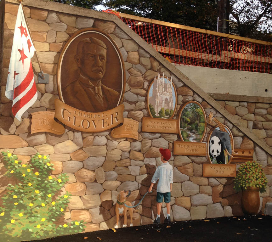
Do YOU know your neighborhood's namesake? Now everyone in Glover Park is aware of Charles Carroll Glover thanks to this mural celebrating his efforts to help make DC the livable city that we've all come to love. Been to the Nat'l Zoo? Glover helped make it a reality. Ever seen the splendor of the National Cathedral? The first meeting to discuss such a concept was in his living room! Think Rock Creek Park is a treasure? Well, Glover lobbied congress to set aside this land for all to enjoy. Pretty incredible guy and I thought his merits should be shared with all. The mural, made possible with a grant from the DC Commission on the Arts and Humanities, also describes the neighborhood's vibrancy and flavor with a kid and his dog - both of which you'll see plenty of as you walk the streets of Glover Park!


God Save the Loo!

shakespeare.jpg

Blank walls? Check
Cool idea? Check.
Brit reference materials? Check. 
Paints? (plenty of red) Check. 
Brushes? Check.

Time to Create!

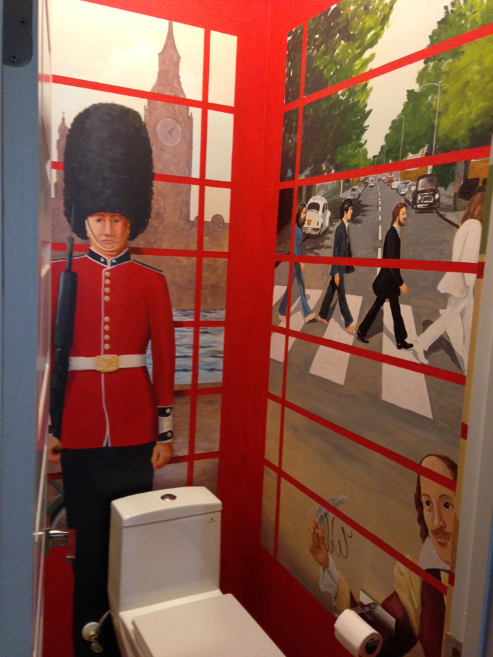
Our favorite jobs have sprung from ideas originally dreamed up by the client and this one is a PRIME example.  Due to the size of this powder room, the couple thought it would be fun to transform this loo into a British phone booth.  Just imagine, doing your business whilst looking out on the iconic British landscape — under the supervision of a guard from Buckingham Palace, Winston Churchill, William Shakespeare (doing graffiti), and John Cleese.

Photos can't capture the sensation but, trust me, the results are fun and the client was tickled with the results.  ENJOY!


"To improve the quality of the day, that is the highest of arts."  ~ Thoreau

And what a time it was...

DSC_00011.jpg

Pearson's Wine and Liquor...  A family owned business established in 1933 when "Doc" Eisenberg bought Pearson's Pharmacy on Wisconsin Avenue in Washington, DC.  At the time, alcohol was sold only by PRESCRIPTION because it was during prohibition.  When booze became legal again (whew) liquor sales overtook the small neighborhood pharmacy.  So Doc, and his wife Sarah, opened Pearson's Liquor Annex - the Pearson's we know of today.  The drugstore is now a gas station!

Steve Silver, and his wife Rae (daughter of "Doc"), began running the store when Doc retired.  I knew Doc as his caretaker would bring him by in the mornings for a short time.  He could barely walk and I never heard him speak.  He must have felt at home there.

One day Steve showed me a page from a magazine, he had carried it around for a while, and wondered if I could "replicate" the look of this advertisement on the facade of Pearson's.  It was a challenge indeed.  A large wall for me to do my thing - public art.  The year was 2001.  We all remember where we were on September 11, 2001...  It was a beautiful morning and I was on the scaffold just doing my thing when Rae came out and thought it best that I go home.  Little did I know at that time that this day would forever change all of our lives forever.

Pearson's
Pearson's

There was much work and planning to be done.  Old signs and marques had to be removed with a crane, prime and paint the entire facade before I even got to lay a brush on the surface. Days went by and I worked on occasionally being summoned down to discuss the work at hand.  I loved speaking with passersby, many my neighbors, and it enriched the entire experience.  Of course, Steve and Rae were great to work with day in and day out.  I got to know them so well, good, honest people running a family business - it doesn't get more real than that.

Well, here we are 13 years later, and it still stands as one of my favorite pieces that I have created.  Thanks go to Steve and Rae for believing in me and giving me the opportunity to do what I love to do.  Enjoy.

To improve the quality of the day, that is the highest of arts.  ~ Thoreau

Stepping on toes? I CAN DANCE!

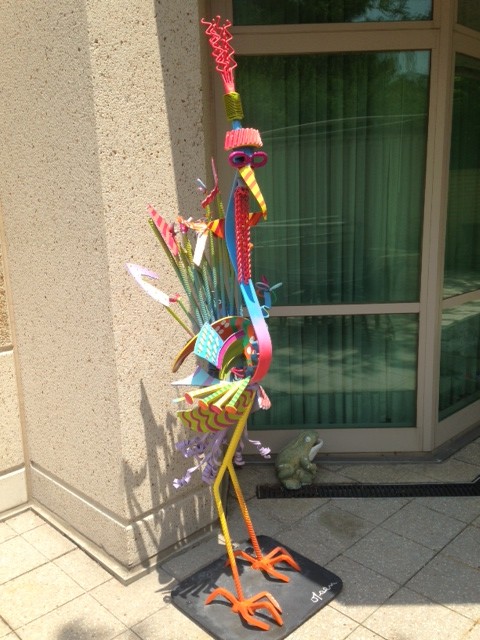
For probably three years, maybe more, a friend has been asking me to "freshen up" a painted iron sculpture of his.  The piece lives outside on his patio and I concurred that it definitely needed some love - Mother Nature had stolen it's colors.  I can still remember encountering it a number of years ago and thinking it was a pretty wild piece made of reinforcement bars, car parts, heavy sheet metal and railroad spikes!  The artist took those ingredients, welded them together then, apparently, gleefully painted the piece as he or she fancied.  Well, sculptor I am not.  Nor can I weld, so I appreciated that aspect of the work.  As for the painting?  Well, after close inspection, it seemed like painting that had been done by a sculptor!  No offense to the sculptors out there! My friend was away but gave me the go ahead to work on the bird.  I had intentions of following the original artist's designs and I snapped a bunch of BEFORE photos prior to starting any fresh base colors.  Here is where the "stepping on toes" part comes in...  I REALLY did not like the painting on the piece.  Was it right to change it?  To follow MY artistic instinct?  Truthfully, I didn't have a choice, I could NOT reproduce what was done before.  Sure, I tried...  But it wasn't long into the work that I realized, instead of stepping on toes,  I COULD DANCE!  I did what I wanted to do and felt waaaaay better about the process and the results.

I got to know the bird pretty well (I bet better than my friend knows her) and the bird and I are buddies now.  My friend is still away so I'm waiting on pins and needles to hear from him as to his thoughts on my variations.  My last thoughts?  I wonder if Mother Nature will fade my work and she'll need to be freshened up again.  If I do it, will I step on my own toes?  Or, if someone else does it, will they too have the desire to DANCE?!

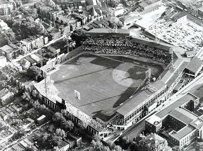
Griffith Stadium Comes Back to DC!

New mural soon to be displayed on the south wall of Circle Liquors in Chevy Chase, DC. 

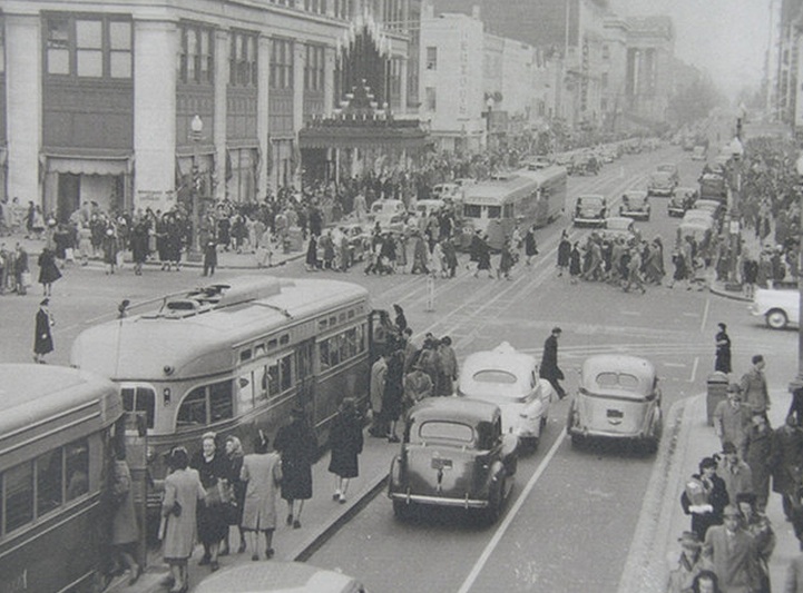
In the late 50's Richie Cohen was a kid who loved baseball. He and his buddies would get on a streetcar in Silver Spring and ride it along Georgia Avenue to Griffith Stadium to see the Senators (who moved to Minnesota in 1961) play ball. These were days of joy. We hope to capture those memories in our new six panel mural, soon to be installed on the south side wall of Circle Liquors in Chevy Chase. We like to think that so many others will relate their own great experiences to that of Mr. Cohen's as they pass by this new landmark.


The panels are putting to use both age old hand painting as well as modern technology. After painting the six small paintings in the studio (one of which was shown on the video), they will be scanned, enlarged and then installed. We hope to keep you informed as the installation process begins.


Angelico La Pizzeria New Neon

Bills-pizza.jpg

Mustafa Misirci, owner of Angelico La Pizzeria, attended a conference of small business owners. One of the speakers mentioned that a store should be "refreshed" every three years to stimulate the interest of the customer... That's where I came in! I had just finished up the Max's Best Ice Cream project and I was eager to share the images with ANYONE willing to look. It was just then that I received a call from Mustafa saying it was time to spruce up the place. Angelico La Pizzeria is a returning customer so I had to give it my all.

At the meeting we discussed a variety of ideas and I plugged hard for the addition of a neon sign. Turns out I didn't need to because he was already considering just that! He wanted his logo in the window in neon. Now, while his logo is attractive, I thought it could be punched up by adding a pizza rather that the red oval that encompassed the name ANGELICO. Mustafa was dubious, afraid it would be too busy. I went out on a limb and offered to design AND paint MY version for free. If he wasn't pleased we could always paint over it with a solid red. More on that later...

After transposing the logo to paper, I travelled out to see my neon guy, Bill Miller, to get his feedback. He thought the pattern was fine but explained that, for him, it needed to all be backwards! Turns out they create these things with all the letters flat - returns, etc need to be behind the visible neon. Love to learn new stuff. Bill is truly a craftsman and was eager to show me the beautiful pizzeria he created. If you ever get a chance to see these folks at work definitely do it and remember, like many things in this life, IT'S WAY MORE DIFFICULT than it looks. I left Bill to his work as I had things to do myself.

So, back to the board. Start with cutting it out. The shape had to be just right to accommodate the neon being created. Too small or too big and I'd need to do it again. I took my time remembering a saying I love - WHY IS THERE NEVER ENOUGH TIME TO DO IT RIGHT THE FIRST TIME BUT ALWAYS ENOUGH TIME TO DO IT AGAIN?

Cut and primed it was time to start the fun part (actually, all of it is fun - If you have a job that you love, you never WORK a day in your life!) by painting in the details. I began with "la pizzeria" and after some hours I found my efforts good. Then a call from Bill, "Neon is ready!"

For the pizza pie oval I decided that to simplify the design and stay away from a cluttered look I would stick with a pepperoni 'za. After a little sketching it was time to pull out the trusty airbrush! This proved to be the right way to go as it softened the image and did not detract from the text. I snapped a photo, texted it to Mustafa, and received a thumbs up! Whew! I really liked the look and definitely did NOT want to cover it all up with a solid RED.

After carefully installing the neon (another fun part I'll have you know) it was time to try it out. It's like a Dr. Frankenstein moment - IT'S ALIVE! IT'S ALIVE!

Along with a helping hand from Mustafa I installed the piece and the smile on his face could not be wiped away - he said it was beautiful. For me, making others dreams come true is just about the best thing in the world. I wrapped the glass with printed vinyl promoting his fare and called it a day.

So, looking back to that conference he attended, he did as was suggested and we "spruced up" the facade of Angelico La Pizzeria in Tenleytown, Washington, D.C.. By the way, the pizza is DELICIOUS there. The signs may draw you in but the food will keep you coming back!

To improve the quality of the day, that is the highest of arts. - Henry David Thoreau

Max's Best Ice Cream Lives On

maxs-best-11.jpg

It was, after 20 years, give or take a few days, the end of a Glover Park landmark - MAX'S BEST ICE CREAM. Max, and his wife Marsha, ran a true "mom & pop" store (yes, in THIS century) that was maybe as well know for it's photos as it's delicious ice cream. I don't know exactly how it started, but apparently they began taking photos of the customers who came in to enjoy a special treat. These photos ended up as collages of hundreds of smiling faces. Not only youngsters I'll have you know. Included there too was Al Gore, Joe Biden, Former Secretary of State James Baker, Former Secretary of State Madeline Albright, Former Attorney General Janet Reno and tennis player Andre Agassi and others! Among Max's avid customers were Laurie Stongin and Allen Goldberg. They would take the boys in for ice cream and they'd stick around to converse with Max and Marsha. They, along with so many others were saddened to discover that Max would be closing his doors. Allen and Laurie wanted to somehow, in some way, keep the spirit of Max's Ice Cream alive and, in the end, they succeeded.

They later explained to me it was an awkward moment... They believed that welcoming warm glow of the neon sign that hung in the window could SOMEHOW be saved. They mustered up the courage to inquire what Max was planning to do with the sign. After finding out he had no plan they tactfully asked if they could buy it from him. Max refused any money but asked them to "give it a good home". That's where I came in!

Laurie, a friend and neighbor, asked me to come by to take a look to see if I had any ideas. I had a true love and recent curiosity about neon though I had never ventured into that world - here was my chance. Allen, Laurie and I worked together to design the sign's new look. We used all but two pieces of the neon that Allen and his son, Jack, had carefully disassembled in the store. With the help of Bill Miller, a man of forty plus years in the business, we learned how to go about the technical aspect of the final product.

The piece would have a retro feel with a painted board behind it. After I applied appropriate retro colors I took a palm sander to it to really age it along but not past it's prime! Max's Best Ice Cream opened in 1992 so I hand painted "Since 1992" in the bottom right hand corner. Laurie and Allen have indeed given it a good home as it brightens their day, and their neighbors walking by, as it hangs proudly in their living room right above the couch. Max's Best Ice Cream lives on!

Carolina Kitchen

carolina-kitchen_mural.jpg

Lance London does it again with his newest Carolina Kitchen! He explains: “I took low-country cooking—Southern cuisine, if you will—and I infused it with a Vegas flair.”  We approached him with this new concept of a jazz themed light box that subtly changes colors.  After seeing a mock up he told us to go for it and "THE C.K. ALL STAR BAND" was formed!  Go check out the piece and enjoy lunch or dinner at his newest restaurant at Rhode Island Row in Brentwood.  

Tropicalia DC

Tropicalia is an awesome dance club on the bustling U St. in northwest Washington, D.C.. People would love the decor, the vibe and the live world music that pumped through it's state-of-the-art sound system. Only one little problem... How would they find the place where you need to go down from street level to even discover it? That's where I came in!

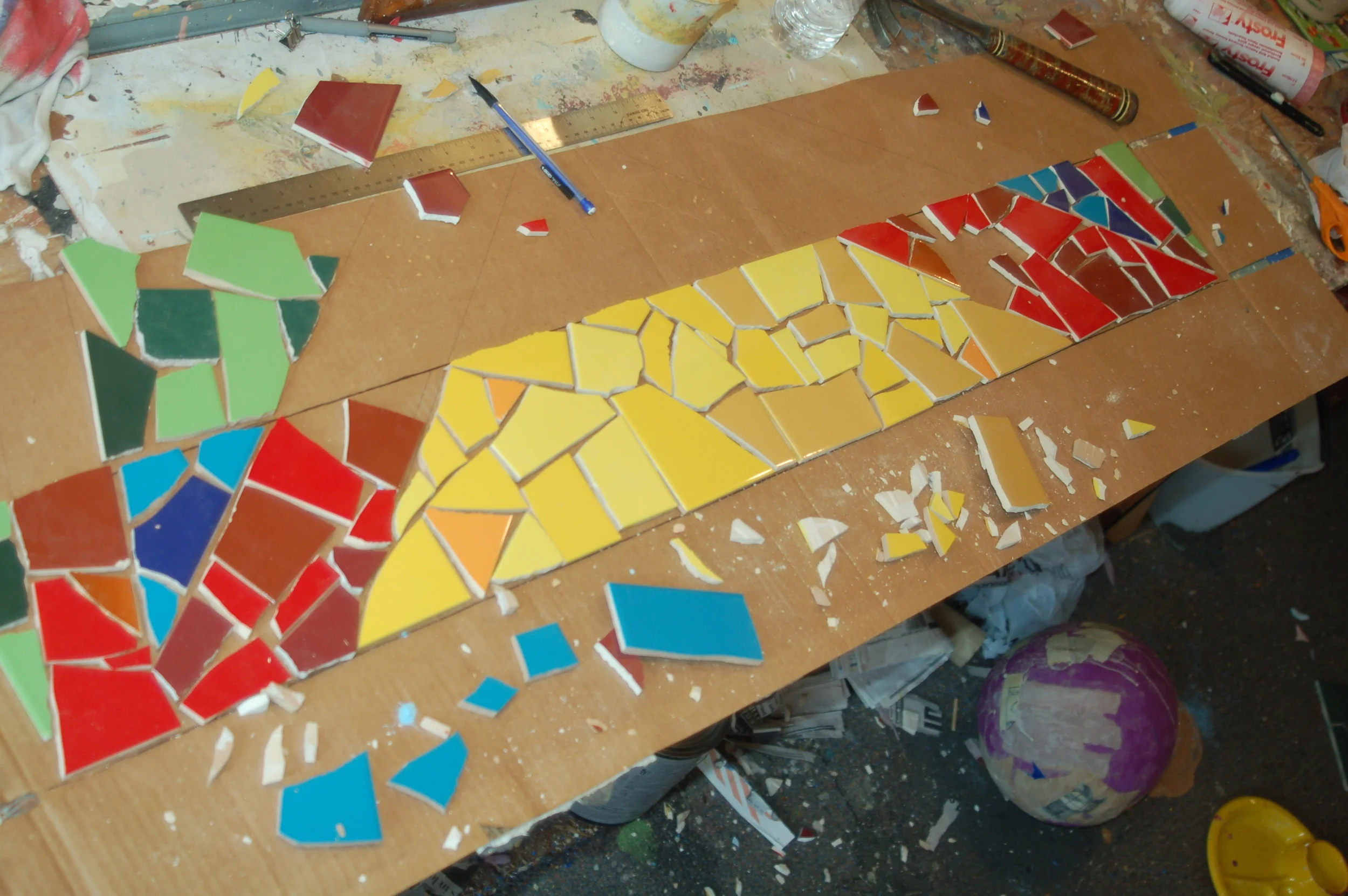
Brian Liu, who I've known for years, was one of the main creators of the concept. He knew I created mosaics and had to get me in the picture. He and I worked tirelessly with the owner to devise a plan to draw people in. A unique blending of colorful Mexican tiles and carefully selected domestic pieces came together to adorn the riser part of the stairs. Now whether it's day or night, one's curiosity is piqued by this beautiful design inspired by steps in Rio de Janeiro.
But wait, THERE'S MORE! Even before we designed the steps I knew the window was another point to attract attention. I devised a way to create the name in a faux stained glass piece. With inside lights subtly flooding the stained glass their color emits a glow that fills the stairwell. It is in this way that I helped to make TROPICALIA the success story that it is today. Put on your dancing shoes and head down to U St. tonight. Check out my work and dance the night away - you'll be glad you did!